Three ways to make your course more accessible
I’ve been a web developer and a teacher for decades. These worlds overlap when it comes to accessibility. So, for this tip I’m going to define accessibility as making your materials usable for every student regardless of their abilities.
More students than you’d suspect do the majority of their coursework on their phones, or may rely on borrowed or public computers. The pandemic has brought to light the number of people who live with insufficient or intermittent internet access. These students also benefit from the accessible materials used by people with physical or learning-based accessibility needs.
You can help everyone by rethinking your approach to three items you normally use: images, PDFs and navigation.
1. Images
Make sure each image loads quickly, contains pertinent alternative (ALT) text, and is worth including in your course. Images are nice but don’t use them just for decoration. Make sure they add value.
- Add comprehensive ALT tags and descriptions for your images. The BC Open Campus Accessibility Toolkit has a great primer on ALT text. ALT text is legally required, and it helps blind or low-vision users as well as students with low-bandwidth who turn off images. The text you include adds value to the image and reinforces the reason to use it.
- Reduce the number of images you use. If you don’t need it, don’t use it.
- Reduce the size of the images you use. Any image you choose to use should load quickly. Reduce image dimensions and compress the file size with your computer’s built-in image editor, or an online tool like Pixlr or Online Image Editor.
2. PDFs
If you have a PDF that the student can annotate — one that is not an image or a very poorly done OCR (optical character recognition) product — fantastic. Consider both embedding it and providing a downloadable copy to give students access options. If you have a scanned PDF, either replace it, use Adobe Acrobat with accessibility editing options, or use a free online OCR product to fix it. Try OCRSpace, which is free and you can create a searchable PDF that still looks like the one you provide.
Ask yourself:
- Can you link out to the same article as a web page by the author? Remember HTML is far more accessible and user-friendly. (This saves you time fixing that pesky PDF.)
- Do you have the original product? Rescan it using a copier with OCR capabilities.
This may sound odd but if the document is short, retype it and a citation directly into the LMS you are using. HTML loads quickly and many assistive technologies are made to use it.
3. Navigation
- Make your course structure easy to navigate. Test how many clicks an item is ‘away from the top’ of the course. Put your core content front and center. Keep the layout consistent and clean.
- Link to optional materials. If the student isn’t interested or doesn’t need it, the resource will not take up screen space, download time or have to be navigated to using their assistive device.
Make it easy for students to get to each part of your course. Think about them trying to use their phone or only having keyboard access — not mouse — to control how they navigate your content.
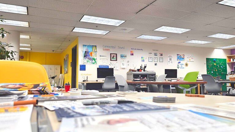
Since I am a web designer first, I will wrap this up with an example of how to fix what bugs me the most: download data and storage space needlessly wasted. For example, this file takes 385 kb to store. We can replace it with a resized, cropped, lower-resolution image 33 kb (a savings of over 90%) in size with the same value for this teaching tip. Save download time, storage space, mental anguish… waiting. Ta da!
This image is free to use from photos.icons8.com:


Do we need this image? Yes, we want to express the frustration some of us have with trying to make excellent courses and then make them accessible. Reduce your discomfort and that of your students, make your course accessible from the start.
References
https://ctl.uaf.edu/how-uaf-instructors-are-improving-accessibility/
https://www.w3.org/WAI/fundamentals/
https://www.washington.edu/accessibility/documents/scans/

Janene McMahan
Former Member of the UAF Instructional Design Team
Quality Matters Coordinator
Google Certified Educator


