Skeuomorphism – How to use it or lose it
“Skeuomorphism is where an object in software mimics its real-world counterpart. The “trash can” is, perhaps, the most recognizable skeuomorphic object. Though the good old “save” icon was once skeuomorphic; but following the demise of the floppy disc – it no longer bears resemblance to the world of today.”
Learning Management Systems (LMSs) are riddled with skeuomorphism and these references to physical forms are sometimes so baked-in that they can be hard to spot. The example above of the floppy disk shows why this can be an issue — most students today have never seen, much less used, a floppy disk.
Let’s look at a common course structure based on skeuomorphism that we will affectionately refer to as the Trapper Keeper.
Like its name suggests, the metaphor is a binder/folder that keeps all your notes, worksheets, the syllabus, a handy list of phone numbers, the schedule, broken pencils, and lots of drawings of that weird S.
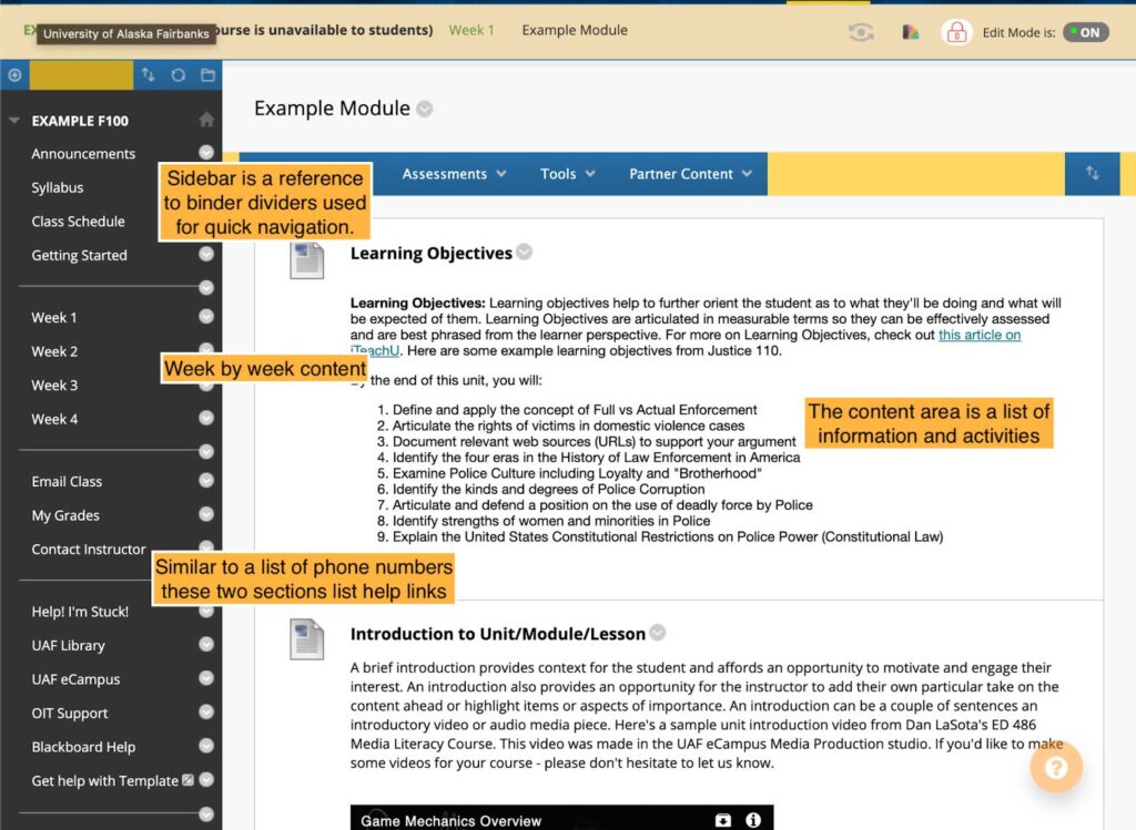
In an online course, the Trapper Keeper uses a sidebar menu to list the course schedule by weeks, divides the textbook and worksheets up into each of these sections, and then lists the syllabus along with resource links for help.

The screenshot above shows a Trapper Keeper set up in Blackboard. Underlying Blackboard (and most other LMSs) is the idea that a course site organizes learning content in an easy-to-access manner. To make this idea functional, they rely on dated skeuomorphic concepts for their interface, like binder dividers as a sidebar for quick navigation.
To its credit, this layout is great for instructors who are just getting started online. Students are also accustomed to the Trapper Keeper, mainly because of how common it is. So what is the issue?
The course site is no longer just a repository of learning content. It is recognized as a place where learning occurs and is supported. With this change, the Trapper Keeper structure only partially meets the needs of a course site.
The digital learning environment is flexible and customizable. Online, each student could have a unique path through the course content, creating a network of paths vs. a single linear path traveled by all students. Embracing the strength of online courses as learning environments requires the intentional use of skeuomorphism or a mix of skeuomorphism and modern web design.
Using Web Design
You’ve likely been using interfaces that are post-skeuomorphic without noticing it. Think about the last website you were on. It may have had a homepage that looked something like the noaa.gov website below.

These interfaces look modern, with a cover shot image, quote or title, and then quick navigation on the bottom. Notice in the screenshot from noaa.gov that the sidebar menu, a reference to binder dividers, is still here. The key difference is the homepage — it serves as the primary navigation method instead of the sidebar. Many of the design decisions in this style are user-focused. Luckily, the Canvas LMS is built with a mix of skeuomorphic and modern aesthetics allowing instructors to make custom homepages.

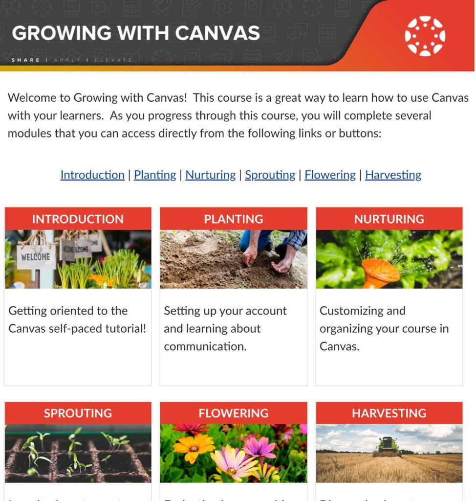
The above image is from the Growing with Canvas homepage. This tutorial homepage has a small banner at the top, a quick description of the course and a set of cards that show images, descriptions and quick links to each section of the course. A student can quickly see the course layout and jump to the section that fits their needs.
Sketch out a homepage design by asking yourself: What is the first thing I want my students to see when they visit the course? Where do they go next and how do they get there? Keep following trails, building as you go.
Using Skeuomorphism
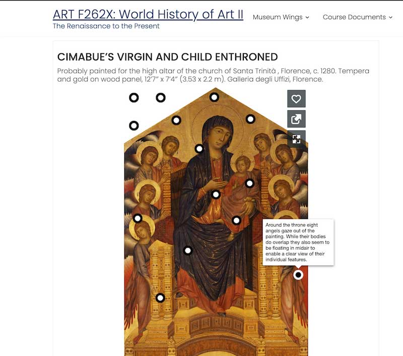
Skeuomorphic design can work to your advantage. The key is to make your reference relevant to the content you are teaching. An example of this is ART F262X: History of World Art II taught by Zoë Marie Jones. The course is designed as a museum with multiple wings, each wing hosting annotated images and recorded lectures by the “museum guide” (Jones).

In the screenshot above, the header section lists the course title and has two quick navigation dropdown menus, one for the different wings of the museum and one for course documents. Below the header shows a painting with annotations. Think about being a student navigating this course: Instead of being in the folder “Week 2” (from our Trapper Keeper example), they are in the Early Renaissance wing at the second set of paintings.
Pairing navigation labels with content AND time creates a robust wayfinding system for students that can reiterate concepts through course structure.
Where would you teach your course if you could teach it anywhere in the world? Get specific, right down to the building/lab/ecosystem/moon crater/cell. Time is also permutable in an online space, allowing you to go whenever. Think about how these spaces are organized and how people find their way around them. Bring these elements to your course design.
Conclusion
In many ways, online education and ed-tech are tied to the metaphor of a physical classroom. Distance delivery, hybrid, synchronous online and asynchronous online are all defined in reference to face-to-face courses and this is unlikely to change anytime soon. Being conscious of the ways software is set up can help you use the platform to create engaging and intuitive digital learning environments. Whether you decide to use skeuomorphism, lose it or mix it, your course’s online structure will be improved by the thoughtful incorporation of these concepts.


So awesome!
Nathan, I am switching all my courses to Canvas in thre Fall. Does Canvas have that feature?
Hey Helga,
Great to hear that you are switching to Canvas! Which feature are you referring to?
Canvas has a homepage feature that allows you to create a page and set it as the first place students land when they come to your course. It also has a Modules feature that allows you and your students to see the whole course as a hierarchical list.