Visualization
Delivery of course content with infographics
If an image is worth a thousand words, let’s get those images into our courses!
How do I start?
Think about the content you want to delivery visually. Look for a few examples of how you may do so. Test out one or two free sites to create infographics–don’t spend more than 20-30 minutes total. You’ll know the site for you when you interact with it.
Once you deploy an infographic as part of a lecture, ask your students (use a quick poll) if it added to their understanding. Check to see if they viewed it: Blackboard allows you to track views, and there are various methods you can use with WordPress to see the number of visitors as well.
Examples
Are your students not reading your syllabus? Madara Mason solved that for Literature of the North (ENGL 350) by using an infographic. https://northernlit.community.uaf.edu/

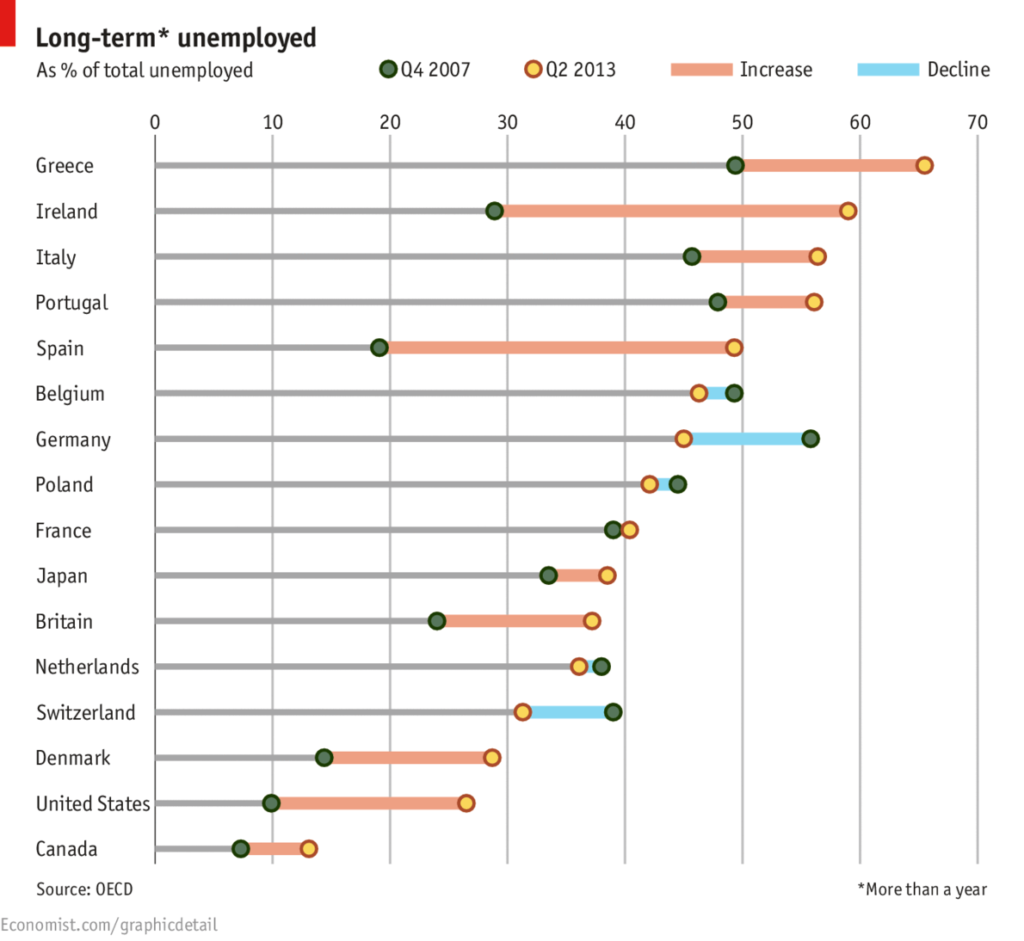
ECON 100X, Political Economy, uses select infographics as supplemental visuals to the reading to improve understanding.

Tell the student why you are including the graphic. “As you read about labor markets and unemployment, you may find the OECD unemployment graphic below to be interesting.”
–Tonya Edinger
The graphics in ECON are used in addition to short videos from Khan academy–to reach the visual learner and capture the student’s attention.
Consider using an infographic for your course calendar, or to show students how each module/assignment builds upon earlier assignments to fulfill course objectives. Example: https://ecampus.uaf.edu/go/easelly
Quick tips
- Consider your audience.
- Focus on one or two main ideas.
- Make your most important point your largest element. Build remaining items around the main item.
- Keep text to a minimum where possible. Include enough so a person is not lost.
- Use up to three fonts. Make sure you have enough contrast between the font color and the background.
- Use green and red in a limited fashion–for those who have green/red colorblindness.
- Get your graphic vetted by another person, preferably one not familiar with the points you are trying to make.
Resources
- https://infogr.am/ – for charts and graphics
- https://www.easel.ly and https://piktochart.com – two easy to use online tools for creating infographics

Janene McMahan
Former Member of the UAF Instructional Design Team
Quality Matters Coordinator
Google Certified Educator


