The art of the welcome announcement
If you are working through the CTL Online Course Evaluation Rubric, you are doing a lot of work to help your students feel welcomed and oriented in your class. You’ve created an inclusive syllabus, you’ve designed a beautiful welcome page and your “Start Here” module is ready to go. Now what?
In an age when students can’t be 100% sure that their online instructor is still alive, sending a welcome announcement is a great way to immediately connect with your students and establish your presence as an instructor. If you are switching over to Canvas and want to change up your workflow, or if you are just looking to polish up your first impression, here are a few tips.
Ensure your students can see your message
Unlike Blackboard, Canvas notifications are opt-in only, which means students may not receive copies of announcements in their email inboxes. If you are teaching on Canvas, consider sending a copy of your welcome announcement via email. If you send announcements often (which is a great practice), you may even want to direct students to adjust their notification settings within your first announcement.
Don’t forgo posting your welcome announcement on Canvas, though! The announcements are a great way to document your communication with students. Direct any students who enroll in your class late to the Announcements tab on Canvas to catch up. You can also make Announcements easily accessible on Canvas by setting them up to display on your homepage. Here is a tutorial on how to set up your display preferences for announcements.
Take advantage of color and image features
In a recent article, “Kindness at First Sight: The Role of Syllabi in Impression Formation,” researchers found that visual syllabus design increased student perception of instructors as “kinder, more creative, and more approachable.” Consider transferring these findings to your first message to students. One advantage of Canvas’ announcement feature is that it offers a full suite of editing functions, including headings, embedded media, and text color. While too many design features may overwhelm your students (and their internet connections!), a thoughtfully selected color scheme or graphic can help convey welcome at a glance.
Add interactive features
A welcome message provides a great opportunity to prompt action. Adding hyperlinks to course content is streamlined in the Canvas announcement interface, which means you can easily direct students to important class pages. You can also set up announcements to include a “like” feature and allow students to add comments. Nudge student interaction by asking them to “like” the announcement once they have viewed it on Canvas. Or ask students to comment on the announcement; this is a great opportunity to ask students fun “get to know you” questions that can range from irreverent community-builders to warm-ups for course content.
Use friendly and accessible language
While all instructors have their own unique communication styles, Chronicle of Higher Education contributor Flower Darby’s recommendation to “infuse your writing with warmth” is a great principle for anyone to adopt. Another way to think of this is to write with the assumption that students will be successful and make positive contributions to the course.
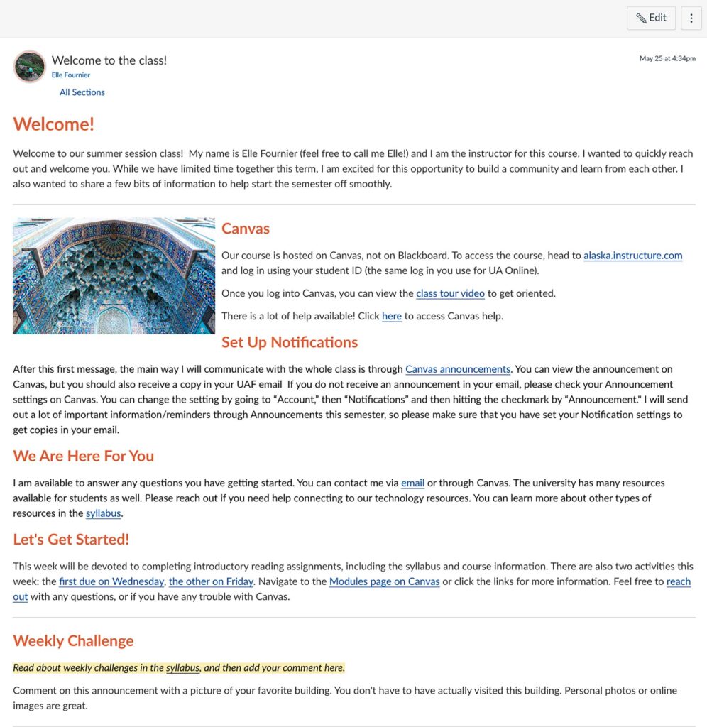
Here’s an example from my own class:


Elle,
I really enjoy Flower Darby’s writing! “Small Teaching Online” by Darby and Lang is a quick read with excellent references. Let me know if you want to borrow it. My copy is all marked up!